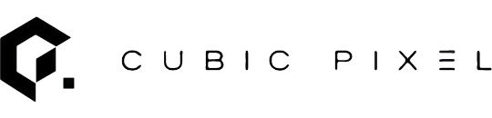

There is a particular feeling, when you have been pushing shapes around a canvas for too many hours, of something quietly snapping into place. Not a fanfare. Just a small certainty that the next move would make the design worse, not better. The Cubic Pixel mark arrived like that — a cube, a pixel, a wordmark — and then it did not need anything else.
Looking at it now, it is almost embarrassingly simple. A bold, angular form. A small square beside it. Clean typography underneath. Nothing extravagant. Like most things worth paying attention to, the story sits just under the surface.
Where structure meets imagination
Cubic Pixel did not start as a brand. It started as a way of describing how I work.
I have spent my career living in the seam between two languages. On one side, the structured precision of engineering — APIs, data models, system architectures, the kind of work that fails loudly when you get it wrong. On the other, the open-ended craft of design — interfaces, type, layout, the kind of work that fails quietly, by being forgettable. Most people are fluent in one and a tourist in the other. I have always wanted to be fluent in both.
The mark needed to reflect that.
The angular shape at the centre of the logo is not abstract for the sake of abstraction. It is a deliberate fusion of the letters C and P — but more importantly, it is constructed like a cube, drawn in isometric, the way an engineer would sketch one. Edges that line up. Angles that mean something. A cube is honest in a way most logo shapes are not. It is predictable. It is mathematically inevitable. Every edge earns its place, every face balances another.
In a world where design tends to drift toward decoration, the cube is a small refusal — a shape that insists on knowing what it is.
It also, let us be fair, just looks good.
The pixel
Then there is the small square sitting just off the cube’s edge.
It is easy to miss. Some people do — until they do not. That single pixel sits slightly apart from the main structure, like it is keeping the cube company from a respectful distance. And the distance is the point.
A pixel is the smallest unit of digital creation. The atom of everything that ever appears on a screen. But within the logo, it is doing a quieter job: it is the design equivalent of a footnote. It says the small things matter here. The cube is the system. The pixel is the detail. Both get attention, or neither of them works.
There is also, I will admit, a structural reason. The cube on its own was a little too composed. A little too pleased with itself. The pixel breaks the symmetry just enough to let the mark breathe. Without it, the logo would be a perfect shape. With it, the logo is a composition.
Those two things are different, and the difference is most of the job.
Minimalism, with intent
Minimalism is everywhere right now. Some of it is considered. Some of it is empty space pretending to be philosophy.
I wanted Cubic Pixel to sit firmly in the first camp. The logo strips away anything that is not earning its keep — not because minimalism is fashionable, but because clarity is the cheapest form of credibility you can buy. Every line is deliberate. Every angle is doing structural work. There are no gradients trying to look interesting. No decorative flourishes hoping you will not notice the design underneath them.
If the mark has a posture, it is this:
I know exactly what I am, and I do not need to raise my voice about it.
That posture matters more than people give it credit for. A logo is not the main event on a portfolio. The work is. The mark is just the thing that sets the tone before any of the work is even visible — the visual handshake. A good handshake is firm, brief, and confident. A bad one tells you everything about the rest of the meeting.
A note on the type
If you look closely at the wordmark CUBIC PIXEL, you will notice the spacing. It is generous. Almost architectural. The letters are given room.
This was not accidental. Tight kerning would have made the wordmark look anxious — the typographic equivalent of someone who has had three coffees and is about to tell you about their startup. The wide tracking gives it the calm of something that does not feel the need to fill every available pixel. (Pun acknowledged. Not apologised for.)
The typeface itself is geometric, monoline, quietly engineered. Which is, in a small way, the entire thesis of the brand.
A mark that reflects how I work
The Cubic Pixel logo is, honestly, the most concise summary of my working philosophy I have managed to put on paper.
Structure first — strong foundations before any decoration. Creativity inside constraints — because constraints are not the enemy of design, they are the condition for it. Attention to the smallest unit — because details compound, and people feel them even when they cannot articulate what they are feeling. Clarity over noise — because most design problems are, on inspection, communication problems wearing a costume.
Engineering teaches you that systems either work or do not, and the universe is rarely interested in your feelings about it. Design teaches you that working is not the same as good, and that the gap between the two is where craft lives. The mark is my attempt to hold both of those lessons inside a single shape.
The quiet confidence of simplicity
The digital world tends to reward whatever is loudest, brightest, and most aggressively new. I wanted Cubic Pixel to do the opposite — to feel grounded, unhurried, and difficult to date.
The designs I admire most tend to feel obvious in hindsight, which is a much harder thing to achieve than it sounds. Obvious is not the same as easy. Obvious is what you arrive at after you have thrown away everything that was not needed, which usually takes about ten times longer than you expected and looks, on the surface, like you barely tried.
That is, in the end, what the mark is trying to be. A simple idea, carefully drawn. A small piece of geometry that quietly insists engineering and design are not opposites — they are the same discipline, viewed from two different angles.
The cube is the system. The pixel is the detail.
I work in the line between them.
